

Mon, July 28, 2008
Graphing Baby Names
Once in a while, I write about things that are only vaguely related to personal finance. Today I found a really neat site that allows you to visualize the popularity of US baby names. Ever worry that your child won't be the only "Emma" in her class?
I have a soft spot for data visualization.
This site enables you to see the frequency with which a name has been used from the 1880s to the present. A site FAQ indicates that the data is from the Social Security Administration, but I was initially puzzled about where the pre-1935 data comes from. I guess that every person living in the US when Social Security started (1935) received a number, so their names would have been recorded as well. The site is run by the author of “The Baby Name Wizard,” so that makes her an expert. The SSA also has its own (less glitzy, but still useful) name popularity website. That site has a tabular data format which makes it easy to see that “Jacob” has been the #1 boy’s name since 1999 - I wouldn’t have guessed that.
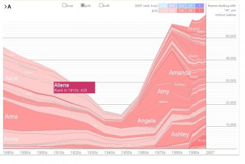
If you have a first letter in mind for a child’s name, you can type it in and winnow the data by looking at names starting with that letter. The screenshot below of girl’s names beginning with A gives you an idea of what the output looks like.
If you’re expecting a child, picking out names probably should come before college planning, but I’m a big fan of early planning. As noted in an earlier post, some friends of mine actually wanted a scheme to allow them to start saving for college even before their child was born. I never heard whether they picked out a name before they started her college savings account....
(BTW, after a huge decline from popularity in the 1880’s, the name “Emma” has rocketed back into place among the top ten girl’s names in the last decade)